
Research
Competitive Analysis
Let's be honest; shopping online is a pain. You rarely find exactly what you want, or miss a sale by a day, or end up waiting months for items to come back in stock. For this project, I sought to better the online shopping experience.
Before creating a solution, I conducted a competitive analysis to see where the gaps lie among potential competitors.

Listening Sessions
I conducted three intensive listening sessions. These sessions were crucial in gaining a holistic understanding of online shoppers' habits and frustrations. I dived deep into their behaviors, preferences, and pain points as they navigated the online shopping journey. By actively listening to their stories and challenges, I unearthed valuable insights that shaped the direction of my user-centered solutions. These insights not only deepened my understanding of user needs but also guided my design decisions toward alleviating key pain points and enhancing overall user satisfaction.
Audience Analysis
Finally, I needed to better understand who would be using this product. I conducted an audience analysis to gain insights on online shoppers.
Key Findings
- More than 3 in 4 Americans speak English. The UI of this product should be written in English but maintain a design optimized for language changes.
- A third of all online shoppers make less than $25,000 a year, suggesting a market for online financial tools.
The Problem
The ability to shop online is one of the greatest advancements since sliced bread, but the experience could be better. Often, users’ busy lives cause them to lose track of items they were considering purchasing or cause them to become overwhelmed when navigating through many tabs and websites to find good deals on their items. Additionally, as promotional emails have become increasingly popular, inboxes can become overfull with advertisements.
The Solution
A tool that reduces the mental load and time of shopping online and helps shoppers save money by keeping track of items and their prices and alerting them when the price drops .
development
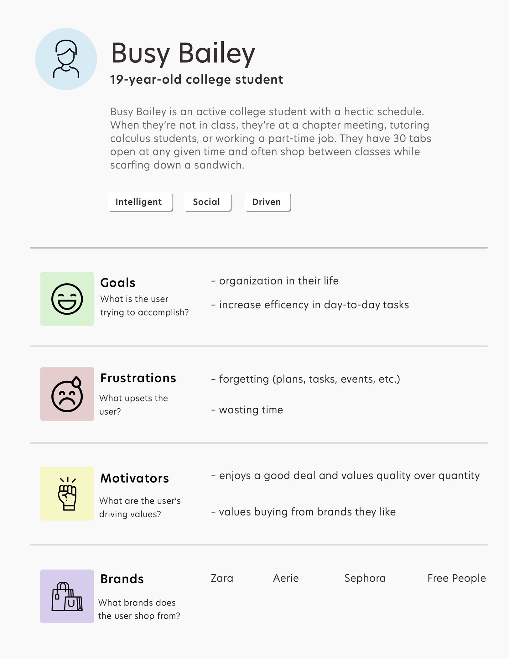
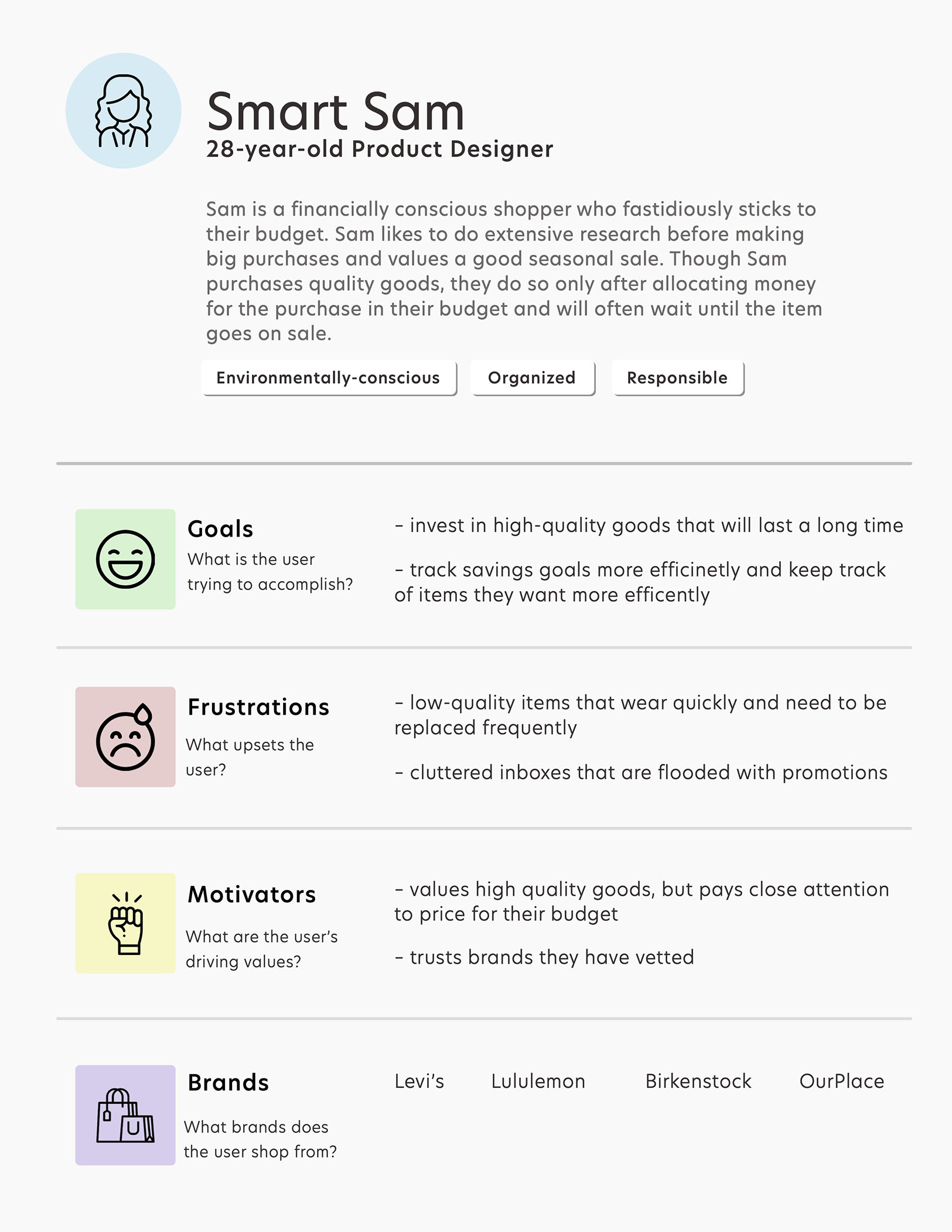
User Personas
Based on my initial analysis, I created two user personas that embody the trends I noticed. These user personas allowed me to ensure I was keeping the design user-centered and meeting all of their needs.
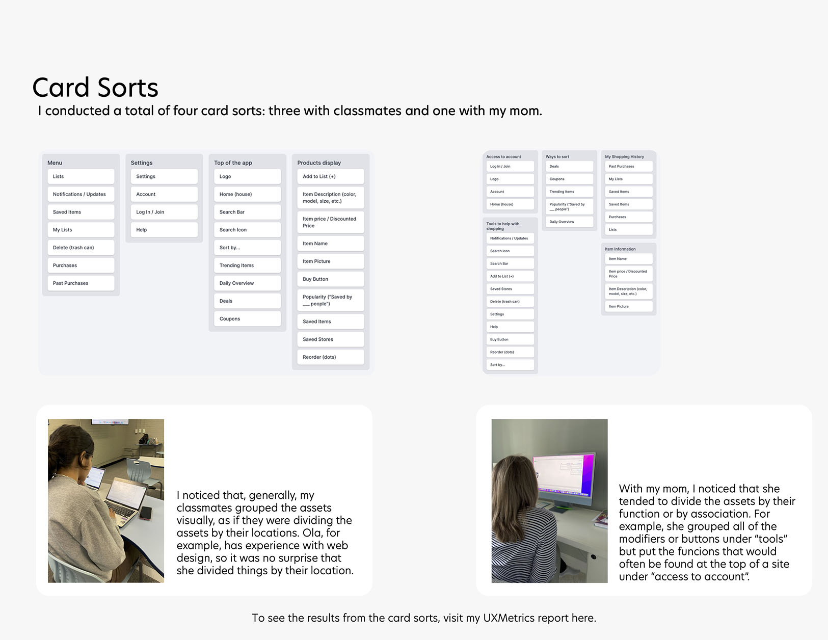
Asset Inventory
After understanding the users and looking at the competition, I created an asset list and conducted 4 card sorts to understand how users would understand the organization of the assets.
Wireframes

High-Fidelity Mockup
A problem that the interviewees expressed was information overload due to so much information being displayed in a way that could have been more manageable and often confused the user instead of leaving them feeling informed. I kept this in mind when developing these mockups so that the UI would help the user rather than further complicate their experience.

Testing
User Testing
I conducted three user tests using UserTesting.com to evaluate user sentiments toward the project. Some of the goals were to determine:
- how easily the user could navigate through the product
- if the user interface lessened user stress while using
- how the branding impacted perceived trustworthiness
Findings:
- users enjoyed the simple UI
- users liked the quantitative information and felt it made the Brand feel more trustworthy
- the site I used to conduct my user tests, UserTesting.com, had an info window UI that blocked a portion of the screen, bringing to my attention how important it is to make information accessible from multiple places
Presenting
Finally, I pitched the idea to my MEJO 581 class in a 3-minute business pitch aimed at gaining investors. I began by introducing the problem, Penny’s value statement, how the product works, what the competitors lack, and a call to action.
I was super nervous going into this presentation, but after a few days of preparation, my presentation went better than I imagined. I feel more confident in presenting ideas to stakeholders (or classmates) after taking this class.
 view project >