
development
Design Approach
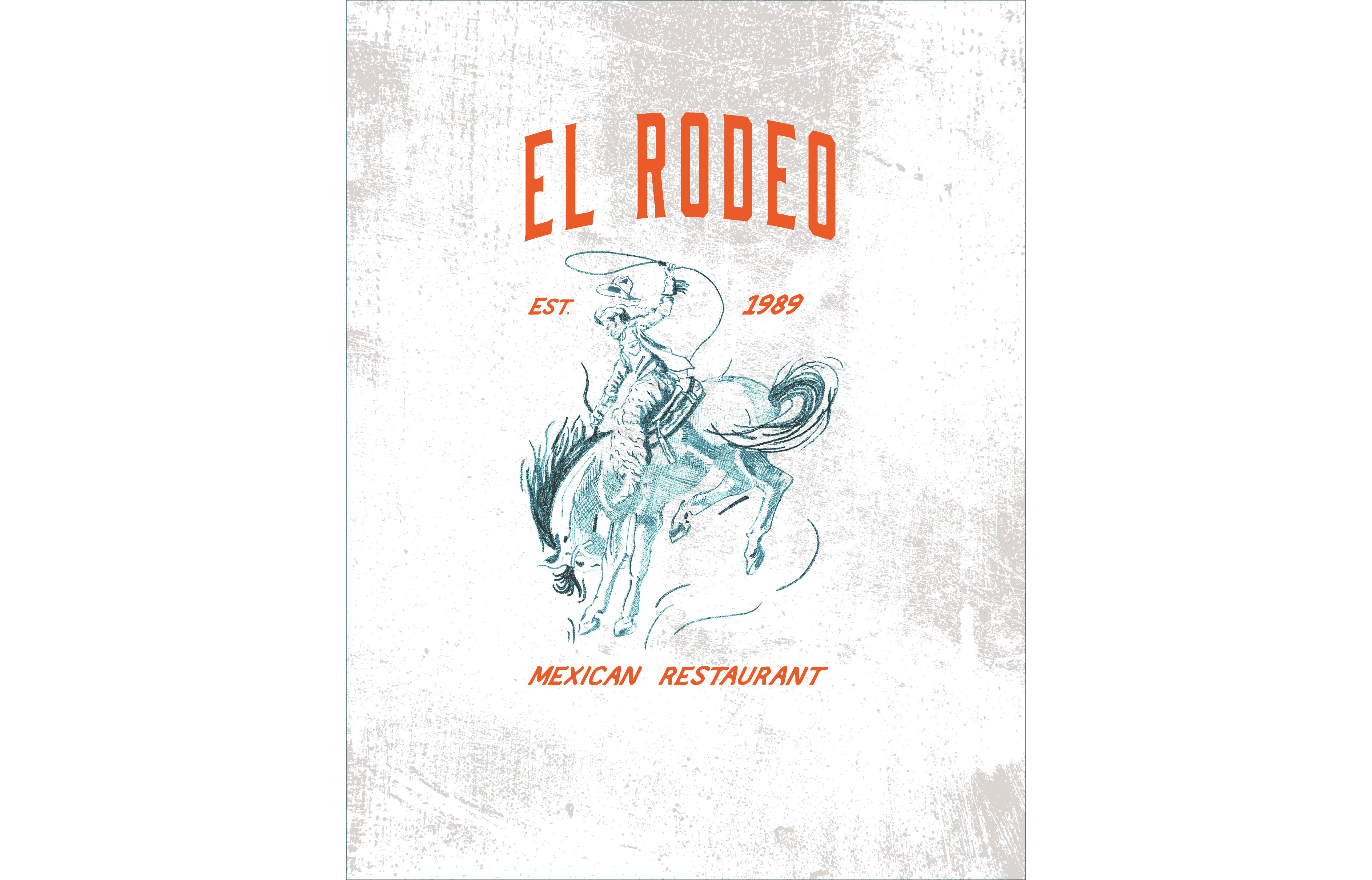
To achieve a balance between modernity and tradition, a mixed-media approach was employed in the logo design process. This methodology allowed for the integration of various artistic elements and techniques, ensuring the final design was both unique and representative of El Rodeo's rich cultural background.
Concept Development
Research and Inspiration: The initial phase involved extensive research into traditional Mexican art, cultural symbols, and contemporary design trends. This ensured that the new logo would resonate with both the restaurant’s history and current design aesthetics.
Sketches and Ideation: Multiple concepts were sketched, focusing on elements such as traditional Mexican motifs, colors, and typography. These sketches were then refined and evaluated in collaboration with the restaurant owner to ensure alignment with their vision.

Mixed-Media Techniques
Hand-drawn Illustrations: The rider, a nod to their old logo, was hand-drawn to infuse authenticity and a personal touch into the design. This added organic touches that maintained the brand's personality and balanced the more modern touches I added later in the design process.
Digital Enhancements: I digitized the illustration using Adobe Photoshop, allowing for optimal edibility. To make it more modern, I made the rider a rich teal that contrasted nicely with the bright tangerine that the owner picked out. A western typeface was implemented to balance out the modern, bold colors.
End Product
Implementation
The new logo will be deployed across various touch-points, including:
- Signage: Exterior and interior signage will be updated to reflect the new branding.
- Menus and Print Materials: All printed materials will feature the new logo.
- Social Media and Website: Their social media pages and website are updated with the new logo.
🏆 Achievements Unlocked!
- Creating mixed-media graphics
- Increased skill in customer relations